
UK English
We’ve added a clear distinction between the two English language options you can use for your job posts and career page. You can now choose between English (UK), marked with the UK flag and UK spelling, or English (US), marked with the US flag and American spelling. As always, you’re still free to fully customize the copy across your career page, job posts, and application forms, and adjust spelling or wording to match your preferred style.
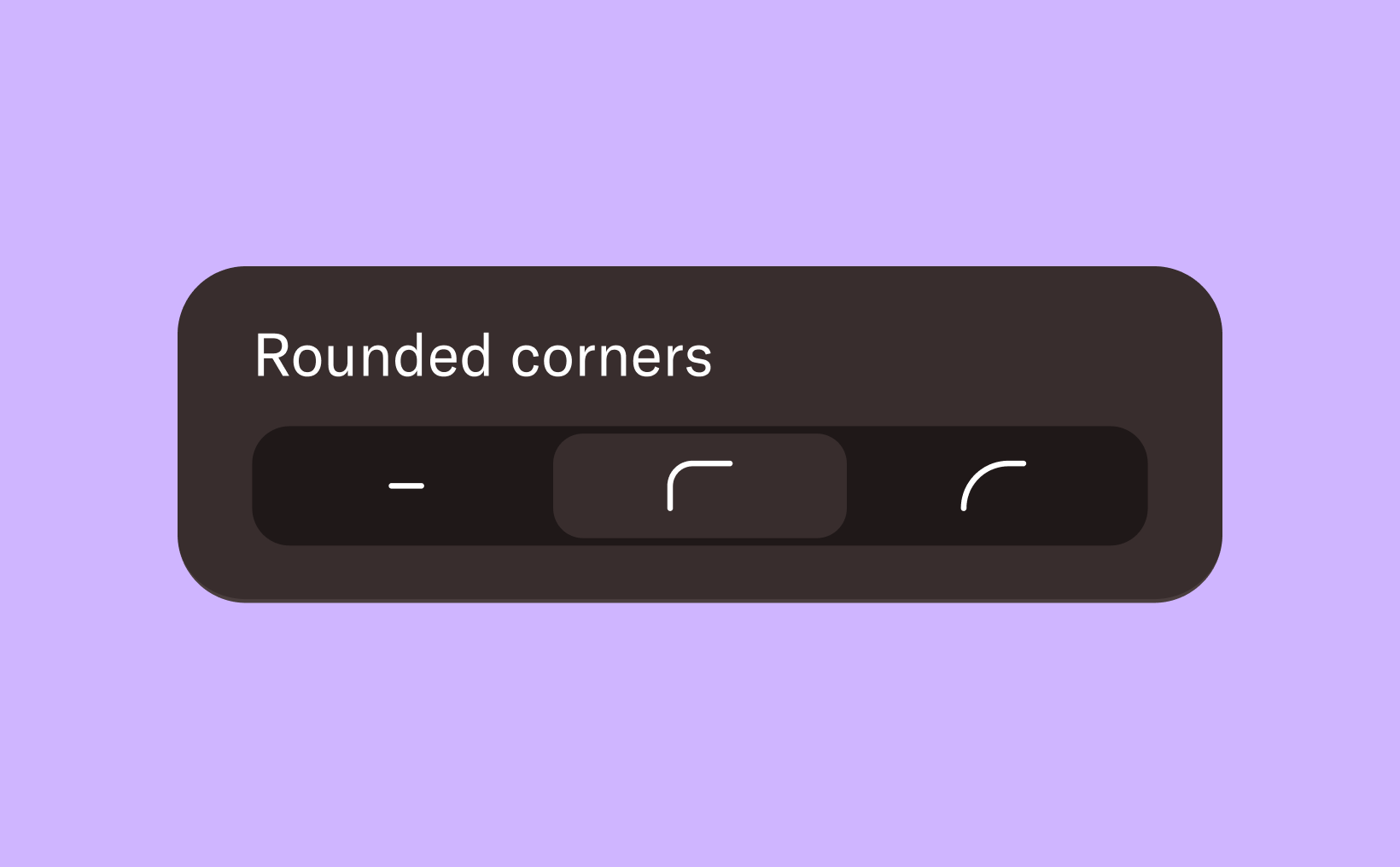
Border radius for images
You can now give your images a more modern and polished look by adding rounded corners. Choose between sharp corners, subtle rounding, or fully rounded corners—depending on the style you want to achieve. This small design detail can help your visuals better align with your brand and create a more cohesive look across your pages.
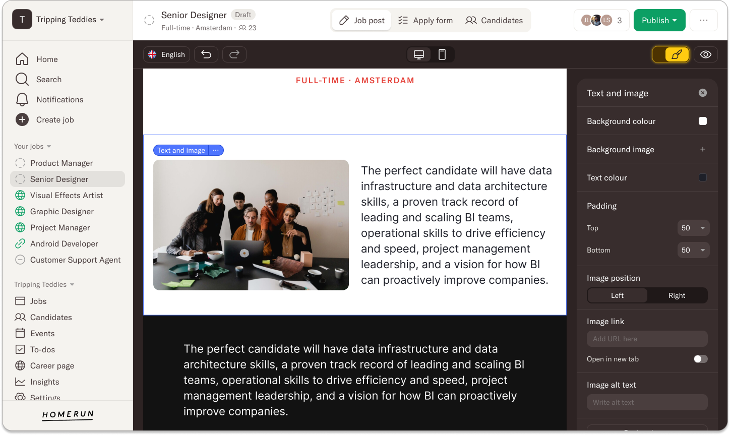
Headings for each job block
You can now introduce each job block with a heading placed directly above it. Previously, this required adding a separate text block to introduce the job block below. With this update, you can add a heading and its related job block all within the same block, making it easier to structure your page and keep everything neatly organized.
Mobile updates for the gallery and “grid” job blocks
We’ve improved how the office gallery appears on mobile, ensuring it’s just as visually engaging as it is on desktop. Images are now displayed in a way that gives candidates a clearer and more impactful impression of your workplace and culture, even on smaller screens. The same improvements apply to images in grid-based job blocks, such as Teams or Clients. These layouts previously didn’t translate well to mobile, but now they’re better aligned with the desktop experience.
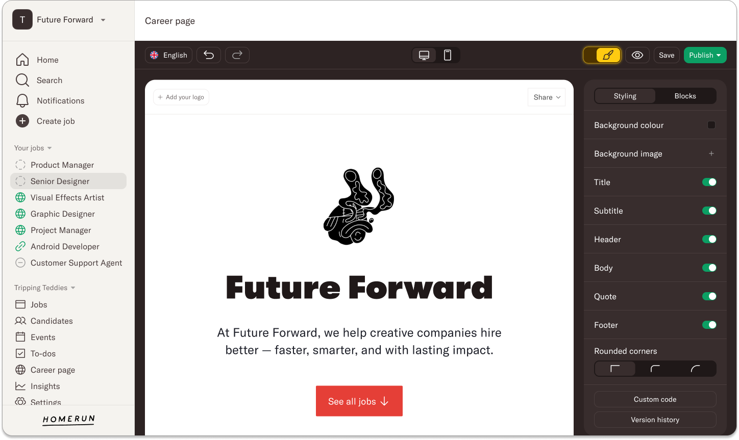
See all jobs
You can now add an optional button at the top of your career page that takes candidates straight to your job overview. This makes it easier for visitors who already know what they’re looking for to quickly see your open roles, while still allowing others to scroll through the page and explore more content. Enabling this button is completely optional and can be turned on whenever it fits your needs.
Design really is in the details, and we hope these small updates make a big difference in how your career page and job posts look and feel. If you have any questions or need help, feel free to reach out to us at support@homerun.co.
.webp)
.webp)
.webp)